Collage

I finished my first collage after taking a class with Rob Szot. Here are my notes- for my future self or anyone who wants to try it.

Start by making marks with pencil or paint that runs both horizontal and vertical on the paper. Populate the areas with scraps of old paintings or drawings on paper that have been cut up. I had lots of watercolor paintings, cyanotype prints and photo negatives in my scrap pile. I love the idea of reusing old work.

After the whole piece is fully populated you look for areas that flow and can be combined into larger shapes- working from small to large which may be counterintuitive. This can be achieved with larger paper overlays, rice paper, crayons (artist pastels), gouache paint, charcoal, Lineco Neutral ph adhesive and erasers. Paper recommended was Saunders Waterford WC HP 425 gsm and Rives Heavy Weight Budd, 175 gsm.

I ran into my first problem when I realized that to cover a larger section of the work – the papers all needed to be the same depth. The collage elements I used where very different with some being very flat and some being on heavy thick paper. In order to solve this problem I looked into soft gels of various thickness and leveling gels. The leveling gels pour over the piece and can pool in certain areas and can crack so I tried a soft gel in two different viscosities- both worked fine. They go on white but dry clear and shiny. The crayons didn’t go on top of gel in a smooth way but were still interesting- I used the gouache paint for better coverage.

Putting on the gel

This day 5 and day 7

I found a Japanese paper store in LA called Hiromi Paper and ordered a few different transparent papers to try-

And finally, I turned the paper horizontally for my last layer and found it flowed better. I loved the semi-sheer overlays.
Abstract Painting – The Rob Szot Method

Check out his work https://www.robertszot.com/

Rob Szot paints with intuition. He feels his way around the canvas and makes decisions based on resolving problems or what feels like a problem.  Does a shape feel wrong? A color? An edge? My accounting background makes me uncomfortable with painting by feeling.  I love the exact process and theory of Munsell’s color system.  I would ask “Did you chose that opaque color because it was next to a transparent one? Why that particular shape? Why put a darker color in that particular spot?” Rob will get attracted to particular area in the painting and say “Right there.  Do that one spot in other places.” And- originally I thought “What did I do in that one spot?”

I did learn to love the process.  It was what I needed as an artist to grow, to push my boundaries and to let go of one part of my brain and use another that I didn’t know I had. I started to trust myself to make bolder decisions and to trust I could get out of a “dangerous” situation if I had to. 

Although, I couldn’t help but try to verbalize to myself some of the process along the way.  Notes for myself if I try this again: 1.  Choose and plan a color pallet before you start.  You can add something unexpected in the final layers. 2.  The edges have to vary-some should be hard, some soft, some disappear. 3.  Layering transparent colors over opaque colors of similar hues are interesting, layering similar hues but different chromas next to each other are interesting, there needs to be light colors if overall composition is too dark and visa versa – different values through out are important. 4.  You need many layers to get the scrubbed out softness to work over the whole canvas, if you scrub out when dry you get a different look than when the top layer is wet. 5.  I found it easier to decide on a shape or flow of the shapes to bring the canvas together instead of finding the shapes and hoping that it flowed together in the final few layers. I projected a shape- in this one the Fibonacci spiral onto the painting to give guidance as to final shape of the whole canvas. 6.  There is a constant push and pull between what colors and shapes look pleasing next to each other and what colors and shapes look right to the painting taken as a whole. Rob says a good painting should have your personality in it.  This one has my love of jungles and gardens in the color pallet and my love of nature and order in the chaos in my final shape. There were hundreds of decisions and hours of work that went into it- and they were mine.

A musician friend, Farrell Burk, created a sound track based off the sounds I created while making the painting. See below. Check out blindingtwinkle.com/blog.

Master Copy

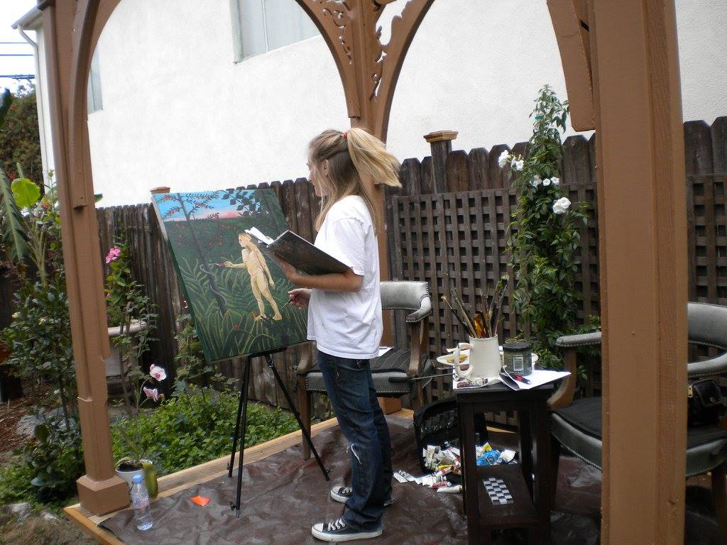
I finished my first master copy today! It took about 6 months to complete – painting about 3 hours a session once a week. I chose a painting by John William Waterhouse. He was an English painter who painted women from Greek Mythology and Arthurian legend. “The Crystal Ball” was painted in 1902.

The first step is to do a pencil drawing using a grid as a guide.

Next set the values with burnt umber.

Beginning to glaze and first layer-

Further development-
Final

Color palette planning

Planning a painting takes time and patience. I used photoshop, the Munsell color system, and color frontier’s color chart utility to help me plan my color palette for Pink Ohara roses. My first step was to import my original photo into photoshop and drop out the colors to better understand the different values. I used the posterzise function to reduce the number of values to 6.

original photo
posterized photo

Going back to the original photo in photoshop I used the color picker / eyedropper tool to identify the colors and added them to my color swatches which I printed out.

Pink O’hare color swatch list

I mixed the colors using the Munsell system the first step of which is to identify the hue. Photoshop can help with this too. In this case it showed me that I was more in red or red/purple “world” than purple.

Identifying the correct hue

Next step was to mix the paint , paint them onto a chart, and label the mixtures. Check out www.colorfrontier.com. Very satisfying.

Time to paint!

Munsell Color System

I have recently gone down the rabbit hole of the Munsell color system. It was developed in 1915 by Albert Munsell. It is a color identification and notation system. It is very specific. For example instead of saying you need the color orange you may say I need a yellow/red hue 5R with a value of 8 and chroma of 6.

Most of us learn to mute colors or knock back a colors vibrancy by adding the complimentary color to the mix. In other words, if I am painting a blue sky and mix a vibrant blue and realize it is too blue and needs to be less intense or less chromatic I would mix in a bit of orange. Orange has a wide range so which one? It is really by trial and error and experience that you get the correct color. With Munsell artists use a gray scale to mute the chroma.

Munsell uses three words to describe the color. The first is hue: (what color is it? Red, Yellow /Red, Green/Yellow, Yellow, Green, Blue/Green, Blue, Purple/Blue, Purple and Red/Purple. The second is value. How light or dark is it? The value scale has 9 values plus white and black. 9 is the lightest value. The third is chroma. How intense and powerful is the color?

There are many books, tools and charts that you can buy to help learn this system. I have the student book edition 6 with cut out cards.

Punch out the color chips
Basic color wheel and value chart
Put the chips in the correct order and glue them in

Each of the 10 colors hues has a page in the student book. In the complete set each of the color hues has 4 pages.

Excited to see where this takes me! There are classes online that teach this technique. Kathleen Speranza is great. https://www.kathleensperanza.com/

Iconography

This was made as a gift for friends of mine who are Greek Orthodox as a house warming present. I had to do some research!

Iconography is a branch of art history.  It comes from the Greek word for “image” and “to write or draw”.  Icons are religious images.  Pictures that have religious meaning are used as subject matter on icons and become objects of personal devotion and meditation. 

Are icons idols?  One of the 10 commandments is “Thou shalt not make unto thee any graven image”.  I spoke about this with Father Michael of the Greek Orthodox Church in Los Angeles.  According to the Catholic and Greek Orthodox view the use of icons is not idolatry because it doesn’t involve worshiping or surrendering of the heart. The icon is not replacing God. The icons are just a visual language. They “speak” certain truths of faith to the believers, only they do that through the sense of vision.  They help to focus prayer and thought similar to looking at a photo of a loved one and feeling love. He did point out that although Jewish and Muslim faiths do not use icons there is mention of God instructing Moses to create images of cherubim for the Ark of the Covenant in Exodus. 

Byzantine painting of icons are done with powder pigments and egg yolk.  The images look flat. 

Renaissance painters used oil paint and tend to look more life like. 

For my painting I used a combination of the two styles.  I used gold leaf and oil paint.

First stage is painting the wood a red color and adding the gold foil and a sealant.

Next I drew an outline with a pencil.

And then started to layer on the paint. It takes many layers of thin paint to achieve the final look.

And finally the icon was blessed by Father Michael who is an artist himself.

Note to anyone wanting instruction in Byzantine Greek Iconography. Check out Theodoros Papadopoulos at https://theodoreicons.com/

Cyanotypes

Cyanotype is a photographic blueprint that originated in the 1840’s. Two different chemicals are needed for this process: ferric ammonium citrate and potassium ferricyanide. They come in powder form and you only need to add distilled water to make each solution which I labeled A and B and then combine equal parts of each solution (solution AB) to put onto paper. I used water color color paper but it will work on most papers and fabrics that have not been treated.

There are two kinds of cyanotypes: dry and wet.

For a dry cyanotype start with your dry paper that has been prepared with the chemicals and then add a photographic negative or objects such as leaves and put them directly onto the paper. Sandwich the paper between two glass plates so that they don’t move and put out into the sun. The amount of time that is necessary to get a good print depends on where you live and time of day. I live in a very sunny climate and found that 4 to 5 min of direct sunlight works best. To make a negative you will need transparency film that works with your printer, and photoshop. In photo shop you size your photo, turn it black and white and then use adjustment -inverse. I found that further adjustments and experiments were needed to get a good print by using curves.

I did some experimenting with bleaching the resulting prints and toning with black tea but liked the original blue best. I added gold leaf and gold painted leaves to my final piece.

Chai Studying

For wet cyanotypes- start the same way with your treated water color paper. However, before you add leaves or objects add something wet -like vinegar and soap bubbles to the paper first. Some people like to add salt, turmeric or other colored spices. The paper is then wrapped in plastic wrap and sandwiched between two glass plates. Additional objects can be added on top of the glass and then an additional piece of glass can be added on top of that to get shadows on the final project.

I used vinegar, soap and turmeric , chamomile flowers and leaves for the following example. I used water color paint and gold ink to finish it.

Chamomile and California Poppies

The Lavender Room

My friends, Dr. Hugh Cassiere who is a critical care physician at Northwell Health’s North Shore University Hospital and his wife and childhood friend, Cindy Cassiere, asked me to make a painting for a special room in the hospital to be called “The Lavender Room”.

This room is to be used by medical professionals who’s physical and mental toll have been effected by the Covid-19 pandemic. The space was created to help the staff relax and recharge. My contribution was to create a painting that was calming and would fit in with the vision for the room.

Cindy was instrumental is fundraising and was also able to convince the TV show “George to the Rescue” that this was a worthwhile cause. The show featuring the Lavender Room and telling the story of the doctors and nurses at Northwell Hospital will be told on an episode of George to the Rescue on NBC on October 17,2020. Here is the trailer.

https://www.instagram.com/p/CGQhaMopHH9/

I knew that I wanted the main color in this piece to be lavender. I used ochre for highlights in the petals because it looks like sunshine and is also the complement of the color lavender. Blue is also a calming color and will remind people of the sky outside and so it became the background.

The ochre petals form a Fibonacci spiral which I use in many of my paintings and wrote about in the blog post called “Athos” in more detail. I used a darker purple glaze on the lower right side of the canvas only. This is to bring the viewer out of darkness and move towards the lighter left hand side and into the golden spiral of happiness and light.

This painting uses both alla prima techniques (painting wet into wet paint) and of painting wet over dry paint and the use of glazes. It is a large painting and measures 30 x 30 inches.

Here are a few photos to show the process:

The Final Painting

Athos

This piece called “Athos” was made for Athos Therapeutics, a bio tech company and is based on the idea of central nodes/points of interest/ ideas that have interconnecting pathways, similar to airline flight routes and part of Athos’s mission to use artificial intelligence to locate central points of biological pathways and essential gene targets.

In order to choose my two central points I used a mathematical formula called the golden ratio, Fibonacci sequence or Phi. 

“Phi can be defined by taking a stick and breaking it into two portions. If the ratio between these two portions is the same as the ratio between the overall stick and the larger segment, the portions are said to be in the golden ratio. This was first described by the Greek mathematician Euclid…”- Live Science.

A screenshot of a cell phone

Description automatically generated

The golden ratio is used in art and if you are interested in examples check out https://drawpaintacademy.com/golden-ratio-in-art/

Colors:

Blue is meditative, cool and calm.  Blue is linked with eternity, supernatural beauty, and religious transcendence.  “Celestial blue” points to something special and to something that is the highest and most valued.  A blue ribbon is for first prize.  Blue chip stocks are for the most profitable companies. Blue is the color of Athos’ logo.

Orange is blue’s color complement (opposite).  It is bold and visible. It is associated with warmth, growth and protection. The symbol of an orange is “transformation like the quality of a forest fire or volcanic explosion.”- The Book of Symbols – Taschen.

Final